While working for Single Source Marketing, I had the opportunity to participate in updating the visual identity of a minor-league affiliate of the Boston Red Sox, the Lowell Spinners. The Spinners are a single-A ball team that has seen some notable players move through the system.

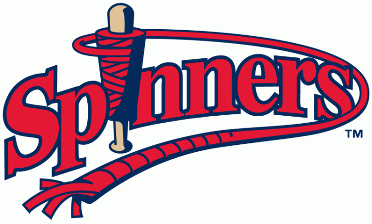
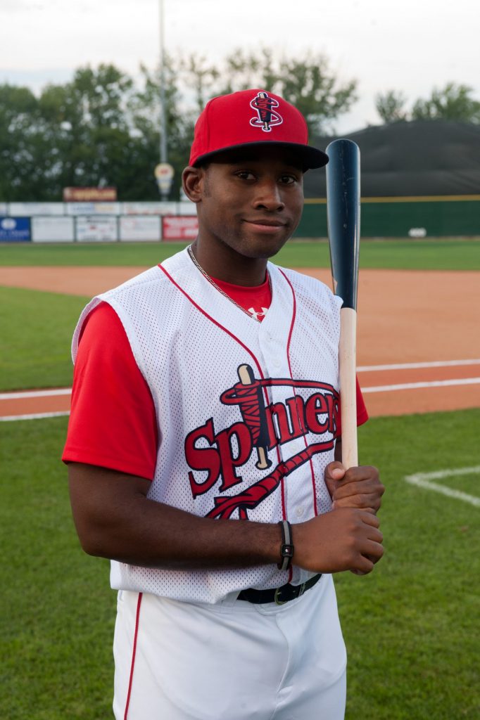
For this project, I modernized the Spinners spindle logo to bring it up to modern standards. I added the string/thread going around the spindle to introduce the concept of an “S” on the logo. I updated the jersey script to match the new logo. I also suggested a home jersey that read “Lowell.” Before this, both home and away jerseys read “Spinners.” This would help sales as people are proud of being from Lowell, MA.

Due to the affiliation with the Boston Red Sox, it made sense to lean into the red and navy colors that represented the team that most of New England already rooted for. Minor League teams can be more playful with their branding because the audience skews younger and while it is still professional baseball, it isn’t life-or-death like watching some Major League teams.
Before Single Source, I had been a designer for ’47 Brand for a few years, so I had a solid understanding of what worked on sports apparel.
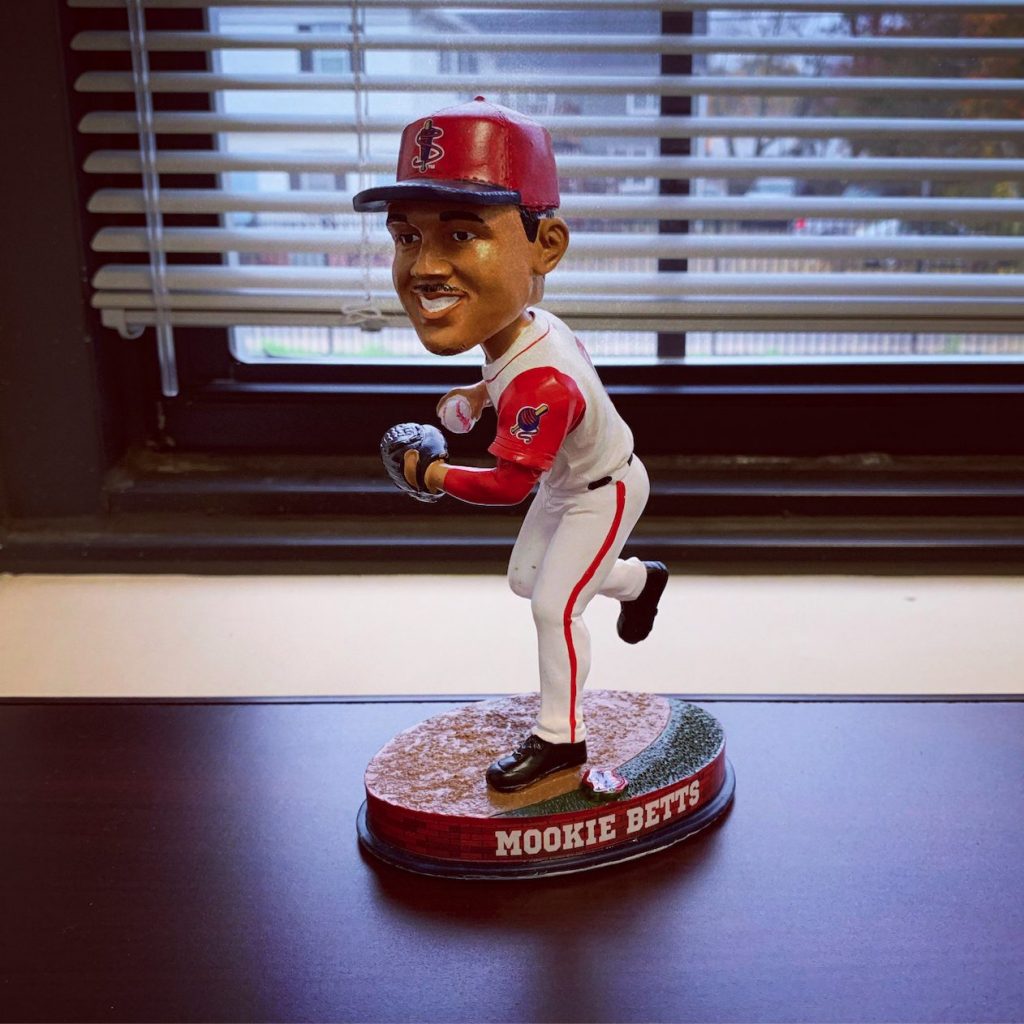
All of these years later, it’s really fun to think that a future hall of famer like Mookie Betts wore a uniform that I had designed.


