
Thoughtfulness Takes Time
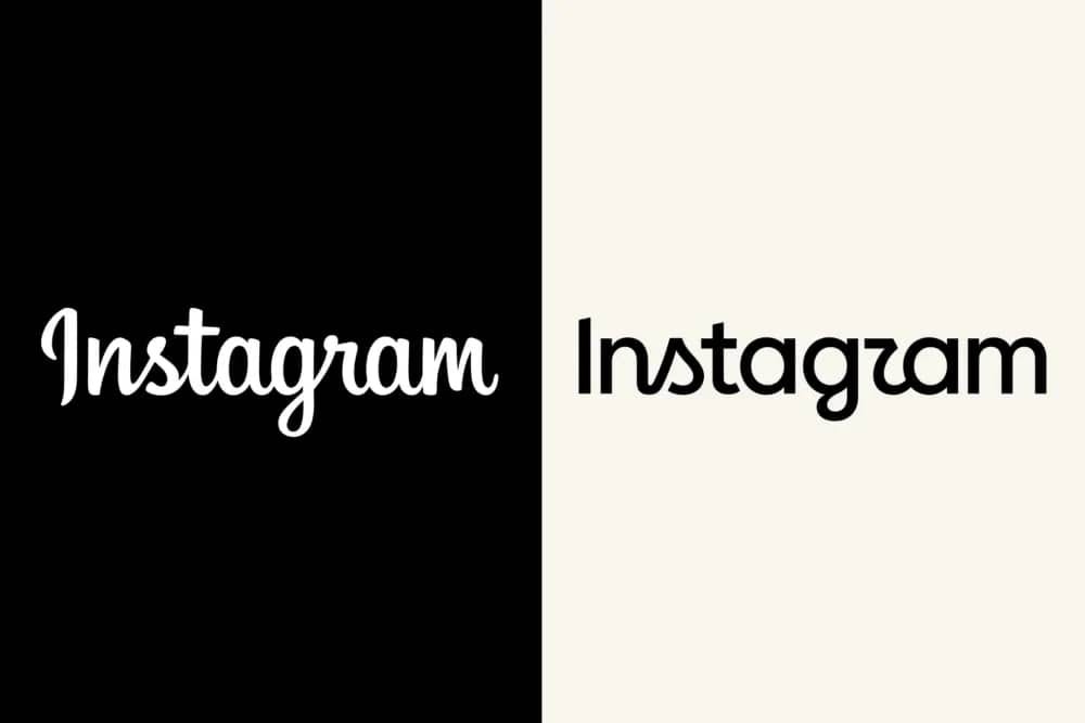
A couple of weeks ago, we saw Instagram launch its new logo, and the reaction was … typical.
Everyone online raced to be the first to say, “I hate it.” This is how social media works. Rage and engage. But let’s avoid that angry rabbit hole for now.
Most of the Instagram takes were basically the same. “The ‘r’ looks like a ‘z.’” Again and again and again. If you spend enough time online, you’ll see that people are not nearly as clever as they think they are when it comes to design hot takes.
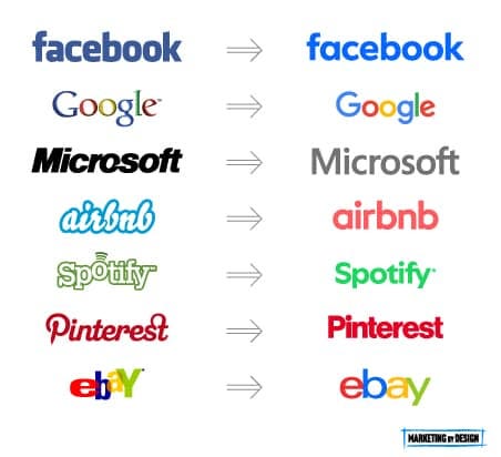
But we just saw a major company rebrand, and it didn’t reach for the flattened sans-serif wordmark that has defined tech rebrands over the past 10–15 years.
After a couple of days of hot takes, I started to see the next wave of responses. These were thoughtful and came from long-established designers.
That’s the habit I default to when something brand-related launches: look at the creative/brand/process decisions behind it before deciding how I feel about it. It’s why I was still paying attention a few days later, when the wave shifted.
Not only did the conversation change, but so did the pool of people contributing to it.
What separated day four from day one
These new critiques focused on the design and brand aspects of the logo. The previous Instagram logo was all cursive. This new logo retained a couple of cursive letters, but changed the rest to a safe sans-serif typeface. Because of this mix, it caused some people to read the “r” as a “z.”
Now, it is possible to dismiss the hot takers with a common knock against younger generations: they haven’t been taught cursive, so they don’t understand what they’re looking at.
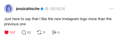
The thoughtful reactions came from designers such as Jessica Hische, Tom Muller, and Allan Peters. Peters, despite what you may think of his content, made a good point: the previous cursive, with its variable line thicknesses, doesn’t work with the monoweight lines on the icon. The mark and wordmark were clearly designed by different people/groups.
(and if you want to see something ridiculous, look at the comments where people try to social-splain design to these experts.)
This became such a big story that Variety covered it. Instagram’s director of product design, Jasmine Probst, explained the reasoning behind the mix and what it was meant to feel like. Probst didn’t dodge the criticism. She walked Variety through the actual reasoning, which isn’t what a team does when it’s embarrassed by its own choices.
“It’s also important to balance research with creative conviction, and the feedback helped us build clarity in the choices we made.”
– Jasmine Probst, Director of Product Design, Instagram
Also, the new logo is a great mix between retro and modern, which is what Instagram has always been. Look at its original logo. Or think about Instagram’s original filters, all warm light leaks and faux print damage, built to make a phone photo look like it came out of a drawer of old prints. Retro and modern at the same time. Just like the new logo.
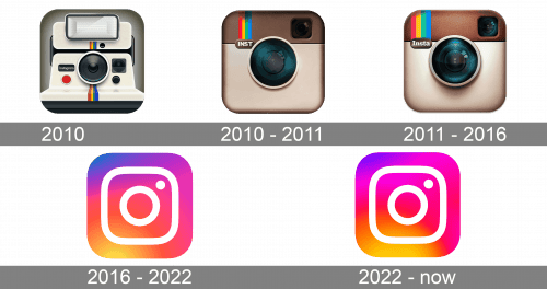
When you start out looking like a skeuomorphic 1970s Polaroid camera, some retro styling in your logo is to be expected.
Scale
It’s fully possible that you looked at it and had the same reaction as many others that the “r” wasn’t fully legible. But you were probably looking at that through the lens of your company. Everyone knows that logos have to be legible. Your company might suffer if your brand identity wasn’t completely legible.
But I’m going to assume that your company doesn’t have 1/3 of the humans in the known universe using your products every month.
Instagram has a level of brand awareness that is nearly unparalleled. Because of this, it can take risks you can’t.
As snarky as you want to be, you knew instantly what the logo said. Nobody looked at that logo and struggled to read it. Let’s try a test. What does this say:
Instag_am
Were you able to figure it out?
You did. Because Instagram’s brand is very strong.
Hot Takes vs. Thoughtfulness
The whole experience crystallized something for me that I had seen, but hadn’t been able to articulate: Hot takes are fast and vapid. Thoughtful, knowledgeable reactions take longer to show up, and they’re worth a lot more when they do.
Since our current attention span is like a superball in a small bathroom, how many thoughtful reactions are ignored because after 24 hours, everyone has moved on to the next rage/engage topic?
I noted on Threads that a couple of days after I posted my thoughts on the logo (I commented about the designer who spent hours trying to fix the ligature between the “n” and “s”), I started seeing more of these expert reviews on the logo. Then I got this great response from @misskatsdesk:
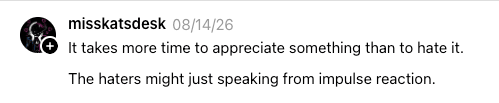
Kat’s onto something, but I’d sharpen it a little. The four days weren’t about giving myself time to think harder. They were about giving Hische, Muller, and Peters time to show up. Years of staring at letterforms is what let them see something the rest of us couldn’t, not the calendar.
Most of us don’t have that kind of practice waiting behind everything we react to online, and that’s fine, most things don’t call for it.
But the next time you feel “I hate it” forming about something, pause a little to think about what went into it before you post anything. Hot takes are fun, but they’re empty calories.
This post originally appeared in the Marketing by Design newsletter.